Case Study - ArcGIS for Microsoft 365
ArcGIS for Microsoft 365 is a suite of mapping tools for business professionals who have minimal to no experience with mapping or GIS. The user experience and user interface design (UX/UI) of these products have integrated Esri’s mapping expertise into Microsoft 365 productivity tools, for an experience that is native to each unique business application. The latest releases of ArcGIS for Office, ArcGIS for SharePoint, and ArcGIS for Power BI are the result of 6 months of design exploration. The purpose of this exploration was to make mapping more accessible and user-friendly to business professionals.
As the lead product designer for these products, my main goals are to improve the overall user experience and transition the products to the latest design patterns from Microsoft, to be more consistent with the Microsoft 365 experience. It’s important that the ArcGIS integrations are consistent with Microsoft experience, so that business professionals can leverage location analytics in their job to be done without having to leave the programs they already know and use. To achieve these goals, I took existing designs and moved towards the end goals in phases. As an example, let’s walk through how I gradually evolved the design of ArcGIS for Power BI.
Phase 1: Identifying the problem
When we began working on ArcGIS for Power BI, the biggest complaint from our users was that the user experience was not sufficiently integrated. Even though the ArcGIS map visualization itself was available “in-the-box”, it felt like a separate application from Power BI. This was quite jarring for a typical Power BI user.
Other than the inconsistent user experience, there were other design and usability flaws. For example, most of the ArcGIS for Power BI tools were only available in “in-focus” edit mode. This made it difficult for users to find and use the tools. The discoverability of these tools was one of the highest customer support calls. Also, the UI elements covered much of the map area in a standard resolution, making the map unusable and hard to see.
On the left is an example of a UI element obscuring most of the map in ArcGIS for Power BI. On the right, is a poor example of a workaround to the "in-focus" edit mode issue.
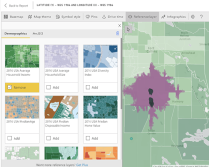
Demographics - Previous Version
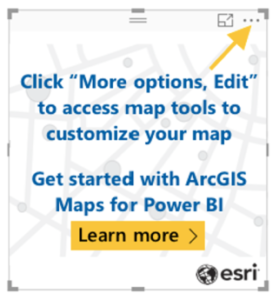
In-focus edit mode - previous version
Here are some similar examples in ArcGIS for Office. Note the overlapping map tools and windows, making the map barely visible:
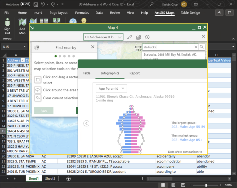
Find nearby & Infographics - Previous Version
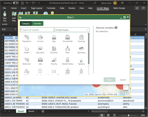
Demographics - Previous Version
Phase 2: Usability and design improvements
The next generation of ArcGIS for Power BI was significantly better but not perfect. The user experience was more integrated. The visual now used Power BI’s fields well to load data on the map, instead of using the map visual to load the data. We added the ability to customize the map tools experience using the Power BI Format pane, and we shifted towards a cleaner UI experience with the ability to condense and expand map tools.
We also introduced radial menus, also known as pie menus. Using radial menus provided a less intrusive experience while maximizing the map area for the users. A single task could now be completed in three or less clicks compared to the previous version where four or more clicks were not uncommon.
Here is an example of the pie menu used. Note that more of the map is visible:
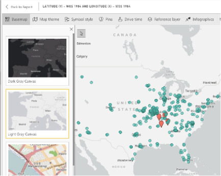
ArcGIS for Power BI - Top Navbar (Previous)
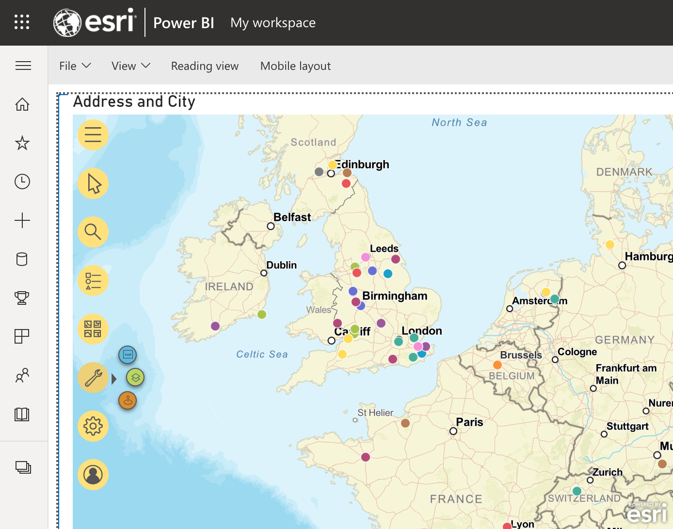
ArcGIS for Power BI - Radial Menu (First Iteration)
The overall user experience of this version of ArcGIS for Power BI was positively received by the Power BI community. However, the user experience and design of ArcGIS for Power BI were still quite different from ArcGIS for Office and ArcGIS for SharePoint.
Phase 3: Integrating Microsoft 365 design
Once we achieved a user experience that felt consistent with Microsoft Power BI, we wanted to create a consistent look and feel across all ArcGIS for Microsoft 365 applications to provide a more native Microsoft experience. We took the successes of ArcGIS for Power BI and applied them to ArcGIS for Office and ArcGIS for SharePoint.
To maintain a visible and usable map area, we introduced ArcGIS for Power BI’s concept of map tools into ArcGIS for Office and ArcGIS for SharePoint. The map tools were redesigned using square shapes with rounded corners, giving the tools a more buttonlike appearance. These new map tools in Office and SharePoint also have radial menus with the options to expand and collapse the tools.
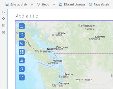
Latest menu design
We also designed and built a library of common UI components that are fully customizable for the ArcGIS for Microsoft 365 products. Having this library of UI components helped us redesign the entire integration to have a more modern experience and will make implementation simpler across all the Microsoft 365 products in the future where changes will only be made to a single code base. Any new future features developed will be part of this common library and all the ArcGIS Microsoft 365 products would inherit these features if appropriate. This library is extensible allowing for UI elements and features to be used for any Microsoft 365 products and yet maintain the “look and feel” of their respective products.
Phase 4: Moving to Fluent UI
The most important design change that we made in ArcGIS for Microsoft 365 was using Microsoft’s Fluent UI to provide a more modern and smoothly integrated experience.
Fluent UI is a set of open source UI components that describes color schemes, shapes, patterns, texture, or layouts also known as a design language that was developed by Microsoft and is extensively used by Microsoft to build their 365 apps. The concept of the Fluent UI is to provide a more integrated and seamless experience across multiple applications and devices. It’s a set of components that enables accessibility, internationalization, and performance with a rich set of APIs for developers on various platforms.
This design language is available for Web Apps, Windows, Android, and iOS. Fluent UI can be used in Figma or Sketch App and provides a set of development libraries for developers on various platforms.
Our team at Esri began using Fluent UI to design, prototype, and implement the next generation ArcGIS for Microsoft 365 and has proven successful.
Here is side by side example of the “clustering” feature used in ArcGIS for SharePoint and ArcGIS for Office. Note the similarity with the map tools and the design components utilizing the Fluent UI design system. Clustering provides greater insight in datasets with many points, making your maps more legible and to find new patterns that are otherwise hidden.
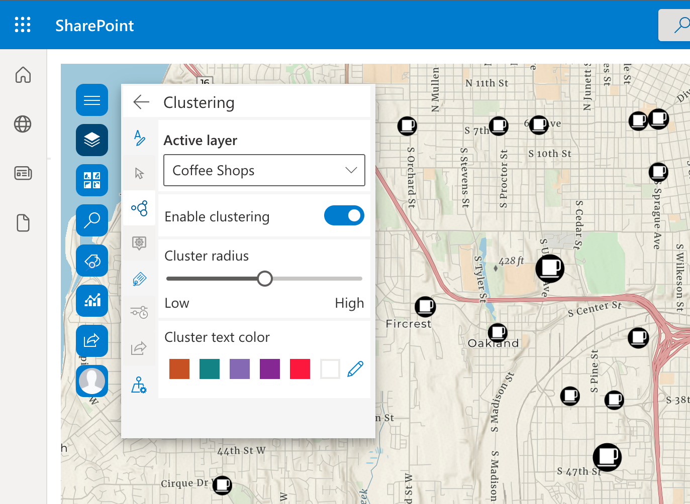
ArcGIS for SharePoint - Clustering
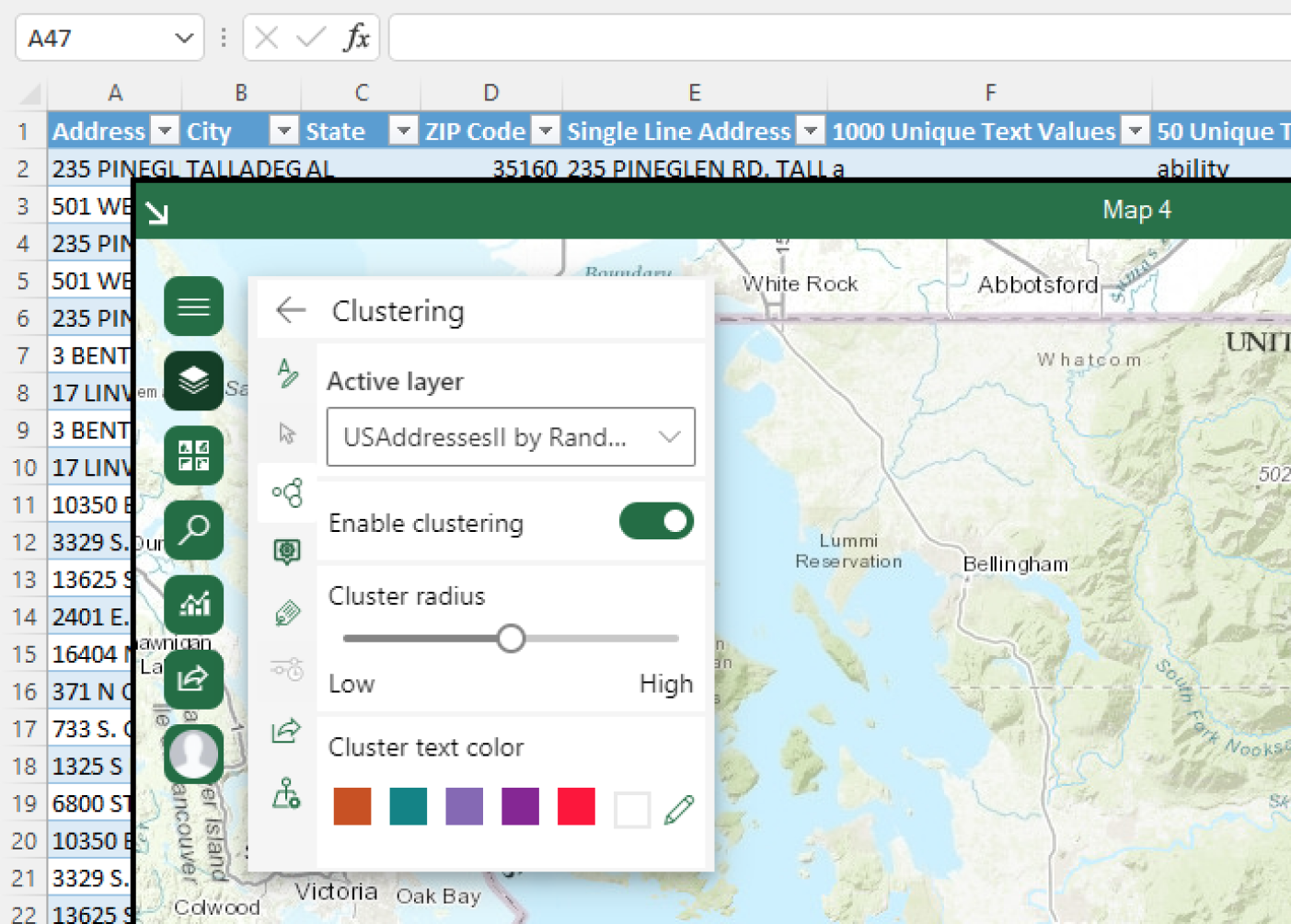
ArcGIS for Office - Clustering
Here is an example of the “labeling” feature in the previous version of office compared to the current version in production using Fluent UI. Labeling is used extensively to add descriptive text to the map. Note the map area is considerably more usable, and the UI is more intuitive.
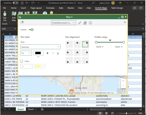
ArcGIS for Office - previous version
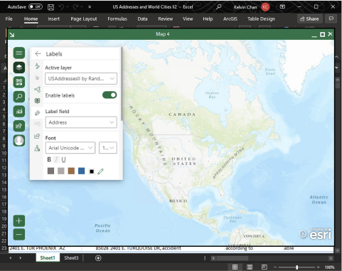
ArcGIS for Office - current version
Our custom library is extensible allowing for UI elements to be used for any Microsoft 365 products and yet maintain the “look and feel” of their respective products.
This latest design in ArcGIS for Office and ArcGIS for SharePoint was released in August 2021 and the response has been positive. We plan to continue evolving the design with updates to Microsoft design patterns, and most importantly our customer’s feedback. The consistency of the design across all the Microsoft 365 products makes it easier for someone to transition between products and get started right away.
While we have done a lot so far, the journey is far from over! New features are being considered and design improvements are currently in progress to make the ArcGIS integration the first choice for spatial data and mapping with all Microsoft products.
